Getting your website to work on the endless new resolutions and screen sizes of smartphones and tablets can be a daunting task. However, to remain competitive it’s important that your websites and web applications are compatible in all modern smart devices. Kochi businesses have started waking up to the reality of this new requirement by 2016. Those of us who refused to adapt to the mobile, saw reduction of organic web traffic and repeat visitors. Responsive web design is one of the mandatory features leading businesses ask web designers anywhere in the world. Web designing in Kochi should not be any different.
Why is responsive design important..?
The concept of separate designs for mobile and desktop is now replaced with
intuitive responsive designs which is compatible for all devices and thereby we
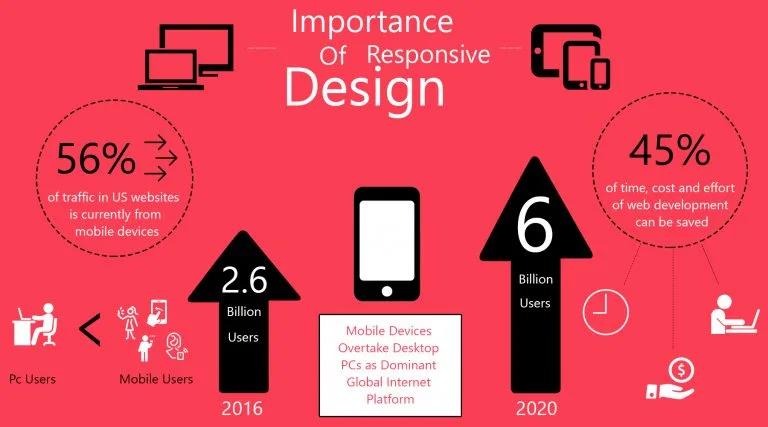
can save 45% of time, cost and effort of web development. If the site is not
responsive, then the readability of the site is different in desktop and mobile.
If the site is responsive we can see the normal images (like desktop) without
any failure.
A major key to responsive web design is knowing your audience and what device
they are using to look at your website. How much of your current traffic is
desktop vs. tablet vs. mobile? Close to 56% of traffic in US websites is
currently from mobile devices. Nowadays there are around 2.6 billion smartphone
users and by 2020 that’s tipped to achieve over 6 billion. Mobile style has
never been more important.

Media Screens
A responsive website design have different media screens for various browser
widths. They are as follows,
// Extra small devices (portrait phones, less than 544 px)
@media (max-width: 544 px) { … }
// Small devices (landscape phones, 544 px and up)
@media (min-width: 544 px) { … }
// Medium devices (tablets, 768px and up)
@media (min-width: 768px) { … }
// Large devices (desktops, 992px and up)
@media (min-width: 992px) { … }
// Extra large devices (large desktops, 1200px and up)
@media (min-width: 1200px) { … }
How to Make a Mobile-Friendly Website : Responsive Design in CSS3 and html5
In responsive design, we will present the same web page that desktop computer
users see to your mobile audience. Only the CSS3, are totally different. That
is, browsers on desktop or laptop computers can render the page using one set of
CSS directions, whereas those on mobile phones another.
Benefits of a Responsive Web Design
Flexibility
Your content is flexible enough to move seamlessly from one screen to next screen with responsive design. This implies that users have the flexibility to access your website on any of their devices without distorted content.
Easy To Manage
When you have different websites for mobile and desktop, you also need two different content strategies, design teams and SEO campaigns. It is very complicated. Responsive design has a single foundation that will run on equivalent methods and campaigns, which means there’s so much less work for you.
Cost Effective
Responsive web design can drastically cut down on development costs and time. Instead of spending the time and resources constructing a separate mobile website in addition to your traditional desktop website, the responsive design approach permits you to optimize your business for all devices with one website. One website costs less than two, and therefore, the savings is substantial.
Improved User Experience
Content is the king in the Internet marketing realm; however, if your users cannot access it with ease. If you create a responsive website, the content can come back to the page quickly and without any distortion. There is no manual resizing necessary to get it to fit; the responsive web design takes care of client needs for you.
Google Recommended
Usually, once Google recommends one thing to the various internet marketers that use their search engines, they must listen. Besides the actual fact that Google owns sixty-seven per cent of the search market, they’re conjointly dedicated to user expertise. They know from expertise that users love responsive design; thus, if they tell you that you just have to be compelled to build your website responsive, that is what you must do.
Avoided Duplicate Content
The newer quality update is the panda update in Google’s search ranking algorithm; duplicate content can affect your rankings. Different sites for desktop and mobile put you in danger of running duplicate content on the web. Currently, Google is a mobile-friendly site in their rankings as well; content printed on the mobile web crosses over together with your desktop content, which means that you simply can be business duplicated content without realizing it.
More Efficient Site Management
The management of your responsive website can price a lot less and take a lot less time than the management of two different sites. There is less content to manage, and you will access all information in one interface instead of coping with the complexities of 2. It is possible to manage different websites for multiple devices, but it will take more money and time. The advantages of going responsive are clear.
Faster Page Speeds
The typical page load time for all devices is seven seconds, which is considerably slower than the perfect time of one second. 40% of all mobile users will avoid a web page if it takes more than three seconds to load. This shows the need for quicker loading times for mobile devices, which are a few things responsive web design will deliver.
Better Engagement
Better engagement with the users will decrease your customer acquisition costs. Any internet marketing agency will advise you to increase engagement indicators such as bounce rate and time spent on your website. This is one way to do that.


